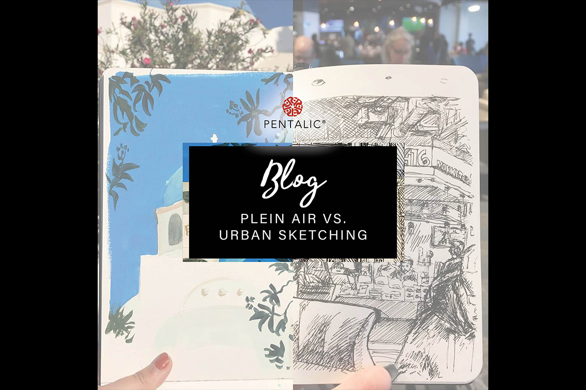
")

Mountain hikes, Disney World, restaurants, wherever this artist goes, she will letter it! Coloradan modern calligrapher and art blogger Veronica Ruiz @veronicaletters discusses the Modern Calligraphy movement, her artistic inspirations and advice for first-time hand-letterers in her interview for the latest Pentalic blog.
You started hand-lettering during your time as a Graphic Design student at the University of Central Florida. What inspired you to focus on hand-lettering?
Letters have always fascinated me. I marveled at hand-painted signs, murals, packaging and logos ever since I was very young. There were a series of lessons, in one of my college classes, on hand-lettered design that ignited a spark in me to pursue lettering. A professor came in with drafts of hand-drawn logos that he had created for clients. These were logos crafted before we had the convenience of computers and editing software. I was in awe of what one person could draw. In this class, we also covered many leading designers in the industry whose core work revolved around hand-lettering and I slowly realized that drawing letters could be a career. I decided then that letters would rule my world!
Who taught you how to hand-letter?
I never had one specific person to teach me. When I started in 2015, there weren’t as many books or resources on what we call ‘modern calligraphy’. Social media was around, but not at the level it is today. Social media now hosts a wonderful community of lettering artists who support each other and share their knowledge. I started hand-lettering by learning about the anatomy of typography, or the standard set of terms used to describe the style and appearance of printed characters. The anatomy of typography is something all lettering artists should know before starting out because it helps to understand how letters are made so we can critique how we draw our letters and improve them! Using this knowledge, I started drawing. I drew letters, upon letters, every day. I tried script and block letters, with all sorts of markers, pencils, and pens. I showed them to my professor and classmates, so I could receive critiques to help me improve. Eventually, I saw progress, which spurred me to continue, and I haven’t stopped since.
Do you believe the Modern Calligraphy movement will remain strong, considering how increasingly digitized art and graphic design are becoming?
Yes absolutely! I believe digital art is making modern calligraphy stronger. Artists will always long for the traditional pencil and paper, so it is nice to have a new type of art to use with traditional methods. However, there has been a boom in digital lettering, thanks to the iPad Pro and the Procreate application. So many talented folks on social media are dedicated to drawing letters in the digital form. It’s not a new practice; designers have been digitally drawing letters ever since the first versions of Adobe Photoshop and Illustrator, but now, digital hand-lettering has become much more accessible and way faster to produce. Before Procreate and the iPad Pro, you would need to purchase a very expensive and large tablet to get even close to what an iPad could do, and you’d still be stuck sitting at a desk. Now you can draw letters anywhere! There are an unimaginable amount of brushes and techniques being discovered every day. The Modern Calligraphy movement, and the portability of it granted by digital formats, has created a burst of creativity that I am so excited we are all around to see.
Who have been your biggest artistic inspirations?
Thanks to social media, I am inspired by all of the amazing artists that I follow every day. It’s so fantastic to live in a time where I can find inspiration at my fingertips. But, before all of that, there was one designer whose work and style I fell in love with, and her name is Louise Fili. She is a phenomenal artist, designer, and creative director, with an expertise in Italian visual culture. This expertise is embedded in all of her work and I was so inspired by it. She specializes in brand development and packaging for specialty food products. I spent hours poring over her book Elegantissima in college. I have seen so much of her work out in the wild and it always brings a smile to my face and stirs up my inspiration!
Favorite Pentalic products and why?
I am all about lettering everywhere and anywhere I can. With that being said, my favorite products are the 5”x 8” Aqua Journal and 6”x 4” Traveler Midnight Draw Pocket Journal (with the black pages). Watercolors and gel pens are my favorite mediums to letter with and these two products make it so wonderful to use those, whether I am home or out and about!
You tell us that you take your sketchbook everywhere to hand-letter, from hiking trails to restaurants. What has been your favorite place to hand-letter on-the-go and why?
I love lettering before a meal. My friends and family are so used to me whipping out a sketchbook from my purse as soon as we sit down. I get to work right after we order. I see it as a mini challenge for me. I tend to letter what food I ordered, so I need to compose the piece and complete it before our food gets to the table. I tend to keep it simple, usually just a black pen or marker, so I can draw quickly, and snap a picture when the food is set down. I’m so lucky that my friends and family support me, and do not to start to eat until after I take the picture. They deserve an award! These pieces and photos make for unique posts. I usually tag the establishment on the post and they always appreciate the piece and reading my experience at their restaurant.
You moved from Florida to Colorado with your husband and tell us that living in Colorado has been immensely inspiring to your art. What is it about living in Colorado that motivates you the most?
The natural beauty of this state is astounding. I grew up in Miami, Florida where everything is flat and it feels like summer for 90 percent of the year. Moving to Colorado and experiencing all four seasons for the first time was incredible. My husband and I drive into the Rocky Mountains a lot to hike and to explore new towns. The landscapes we come across inspire me the most. I get a view of the mountains every day when I leave my apartment, which gets my creative juices flowing!
What is your life mantra and how does it play a role in the art you create?
I think it’s so important to strive for progress and not perfection. As human beings, it is so easy to be pressured by society to compare yourself to others. As creative individuals, it is even easier to think your art needs to be perfect. It is a common mistake to think the artists you follow on social media create perfect work. They don’t. Everyone makes mistakes and everyone starts at zero. When I am tempted to compare myself with someone else I follow, I try to remember these things: I am on my own journey, on my own time. Someone may create work that I deem better than mine but that does not make mine bad! If you are starting out, please keep in mind that the artist you admire had to start and be in your shoes at some point too and look at where they are now! Always strive for progress because perfection doesn’t exist. Keep your old work! It’s so inspirational to look back and see all of the progress you’ve made.
As an avid hand-lettering blogger and teacher, do you have any advice for artists wanting to try hand-lettering for the first time? What kinds of tools do you recommend starting out with?
Please make sure to research the anatomy of typography! There is so much free information online and it will help you understand how letters are constructed, which will, in turn, help you improve your letters. After that, I would suggest starting off with just some lined paper and pencil. You don’t need fancy materials to get started. I know that it’s tempting to buy fancy materials because there are so many pretty markers and tools that everyone else is using, but you can’t just pick up those materials without some experience. Plus, you can save some money for a bit! You’ll need to research fauxligraphy, or faux calligraphy, to use with your pencil. This technique will teach you which strokes should be thick and which should stay thin. You will carry this knowledge with you for the rest of your lettering journey.
Once you feel comfortable with drawing letters, you can move on to using markers that are easy to manage; markers with a short, flexible tip are best for hand-lettering. I always recommend broad tip markers. These are the kind we all used as kids (Crayola markers) and they are super affordable! Worksheets are a great resource for learning how to hand-letter, so check out your favorite artists and see if they sell any worksheets to practice on! These are a great jump-off point to developing a style. A unique style will develop naturally, so don’t stress about it too much.
Once you feel like you can dig out those fancy markers, go ahead and have some fun! Keep in mind that brush markers with longer tips are always more difficult to letter with because you can’t control them as easily. Every pen and marker are unique. No matter what skill level you will always need some time to play with a pen or marker before you are comfortable lettering with it.
I hope I have been able to help you on your lettering journey no matter how far you’ve gone! Happy Lettering!
Follow Veronica!
Instagram: @veronicaletters
Facebook: @VeronicaLetterss
YouTube: Veronica Letters
Website: veronicaletters.com